11-05-16 // TO DO, OR NOT TO DO, …

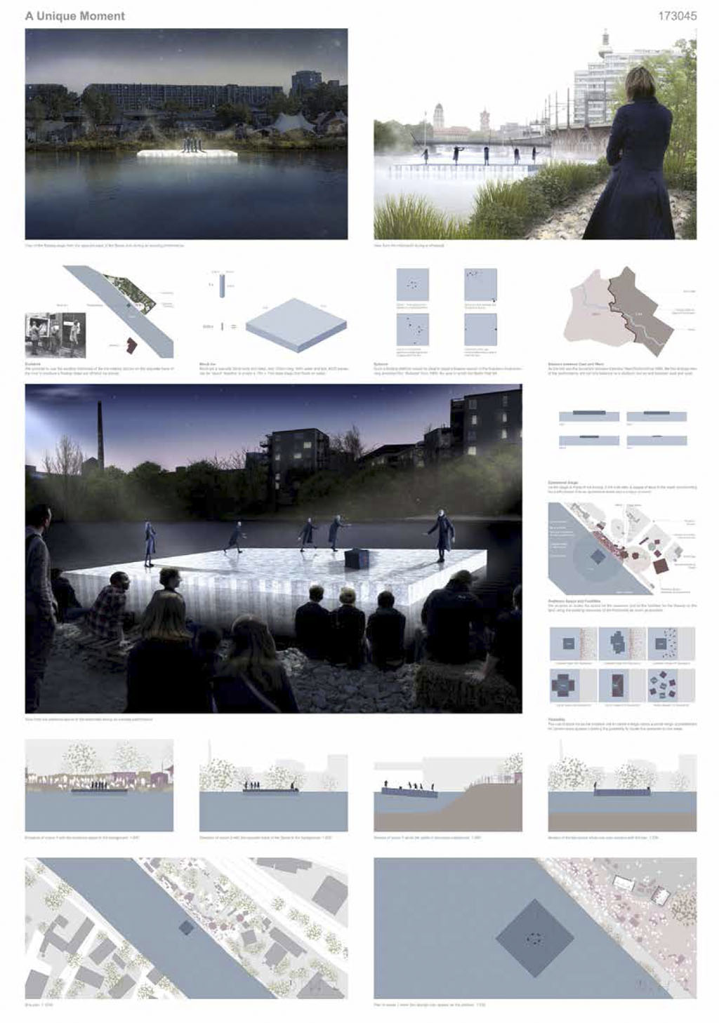
Panel layout of the competition entry for the project “A Unique Moment”
To do, or not to do, …
By Bernd Upmeyer
When several years ago I was teaching an architectural design course at the University of Kassel in Germany, at the very beginning of the semester I asked my students to present a draft layout of their final project presentation panels, typically 3 A1s in portrait orientation. The students reacted slightly confused and thought I wanted to fool them as their designs were still in the very early stages and the final project presentation was scheduled for the end of the semester, which was around 3 months ahead. So, they vehemently complained to me, saying they didn’t know why the hell I was asking them such a stupid thing. They didn’t know what to show on the panels, as some of them had barely any design in mind. But I insisted and explained to them that simply by knowing the scales and necessary number of drawings and images, they already were able to produce a schematic and pragmatic layout of their projects. Furthermore, I explained that this little exercise would not only help them tremendously in discovering what they actually had to work on during the next 3 months, but especially what they should not work on, which eventually would save them a lot of time avoiding working on things that would never be shown anywhere. In the end, everybody was happy to have been forced into this little exercise, as it turned out to have been very useful indeed.
The way I urged my students to create pragmatic and schematic panels at the very beginning of their projects, is exactly the way I start my own projects, especially architectural competitions. The main aim of this little graphical study is always to know from day one exactly what not to do and thus to be able to spend every working hour on things that will be really shown on the competition entry panels at the end of the project. That is, for example, the reason why most of my panels are usually organized in a simple grid, distributing the content pragmatically on each panel and according to the demanded material. In that way the layout of the panels almost appears autonomously. Usually I design only the first panel and continue with the same layout on all the other panel pages. This rigidity in the way I make competition panels, which is sometimes ridiculed by some of my colleagues, does not only help me to work on competitions in an efficient way, but also helps the people of the competition team to focus on what really matters, while knowing from the beginning what the final outcome and delivery will look like. In that way the panel layout organizes the entire project from the beginning to the end, becoming much more than merely a layout, but a working method.
Title: To do, or not to do, …
Author: Bernd Upmeyer
Date: May 2016
Type: Commissioned article
Publications: New Panel Layout for Competition Volumes 4,5,6
Publisher: DAMDI Publishing
Location: Seoul, South Korea
Pages: 176