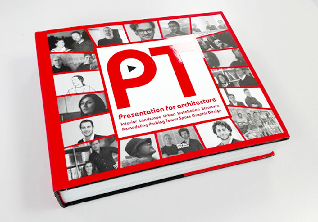
09-11-16 // 3 OF BOARD’S NEW PROJECTS ARE PUBLISHED IN “PRESENTATION FOR ARCHITECTURE”

BOARD’s new projects VERTICAL PUBLIC, UP, AROUND, AND ACROSS, and LAGOON BREITENBRUNN appear on 34 pages in DAMDI‘s new publication entitled “Presentation For Architecture”.
Together with the projects and an interview the following text on presentation methods by Bernd Upmeyer appears in the publication:
Long Live the Standards!
I must admit that we actually never use the presentation programme PowerPoint in our office. The only time I have ever used PowerPoint was during my studies in the 1990s, when the program was still new and by a lot of people considered to be state of the art, even a synonym for presentation. But I am not representative and I am sure many people still are using PowerPoint today. Because whenever I take a train these days I witness a lot of people working with it, especially people who work for large commercial companies, preparing their presentations on the way to their clients. One can see them typing texts in the centre of the page, usually squeezed between a large company logo above and a not much smaller presentation title below, as is typical PowerPoint behaviour. Since my time as an architecture student, I was not used to integrating texts into my presentations, or at least not texts alone, but rather full page bitmap or vector graphics such as JPEGs or EPSs. This meant that all the features that PowerPoint provided gradually became unnecessary and redundant for me. Thus, already by that time, I started creating pages directly into application software that could manage, integrate, and organize different files into a sequence of pages in a very simple PDF format.
Ever since that time I have been creating presentations that way, without PowerPoint. And since my office increasingly became involved with the creation of books, magazines, and competition posters, we started using more adaptable and complex publishing software that could handle all our different graphical outputs easier as well. But the final product of all of this work is still a PDF that we usually produce in standard ISO sizes such as A3 or A4, and with the typical aspect ratio of square root of 2, or approximately 1:1.4142… the entire text will soon be published together with the interview in Writings.
