12-06-18 // ARCHITECTURAL MATERIAL – INTERVIEW WITH BERND UPMEYER
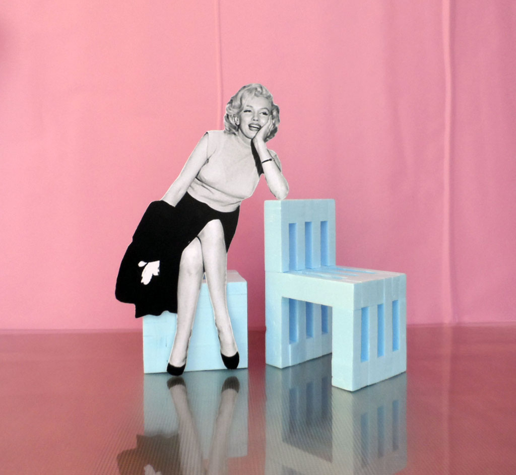
A chair called “Mari” and a stool named “Lyn”
Architectural Material
Interview with Bernd Upmeyer
DAMDI: What is material to an architect (or to you)?
Bernd Upmeyer: To me material is usually the final physical manifestation and embodiment of an idea or a concept for a project. In most cases, and especially in architectural competitions, it is the last thing that has to be decided on. What I am interested in is that the material of a project is as tightly as possible related to the original idea of a project, and translates this original idea into the space as literally as possible. Only then, I believe, a material acquires a bigger meaning and develops the power to create objects, spaces, and shelters that support and improve our lives, which is at the end of the day the most basic function of architecture and design.
DD: Tell us about your favourite (or most often used) material and why.
BU: Although I don’t have a particular favourite material – as it depends always on the project and its relevance in relation to the conceptual idea of project – I am quite a fan of styrofoam and in particular blue styrofoam that comes usually in the form of boards. What fascinates me about this material is that it represents to me one of the most exciting parts of architecture: the process of creation. Because every new project we usually start with an enormous amount of testing with scale models. And this trial and error design method is always processed in blue styrofoam that we purchase at a local hardware store here in Rotterdam and shape with a hot-wire foam cutter. Our project Mari and Lyn – two very simple and very affordable pieces of furniture, a chair and a stool, that can be self-built – has to be seen as an homage to this beloved and extraordinary material.
DD: When do you decide the material during the design process and what are your criteria? (e.g. budget, client’s preference, design concept, climate, etc.)
BU: The design project Mari and Lyn shows that it happens sometimes that the choice for a particular material is made even before the designing starts. However, in our work this is an exception. But in the case of Mari and Lyn the material came first and influenced the design with its characteristics, size, and availability. Because with the project we wanted to celebrate blue styrofoam not only as a great model-making material that is very light – styrofoam consists of ninety-eight percent air – highly stiff and very easy to cut, that swims while resisting moisture, and is relatively cheap, but also as a great architectural design-tool in general that became world-famous after having been used by the Dutch architectural avant-garde of the 1980s and 1990s.
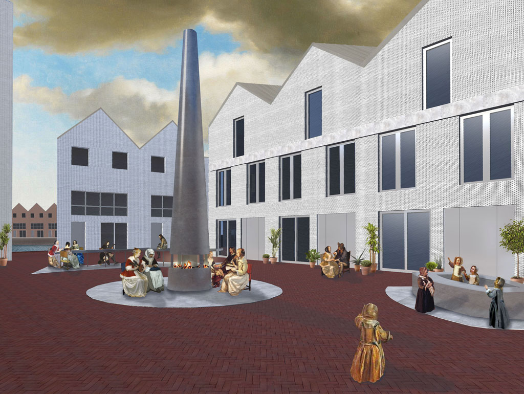
View of the square of the “Home Outside” project with a brick surface
Brick
DD: Tell us about your favourite project that you used brick in – it can be in the interior, on the facade, doesn’t matter where it’s used.
BU: Until today, we have done only one project in which we used brick, which is the design of a square with urban furniture, a project that we called “Home Outside”. There, we proposed to use brick for the surface of the square to connect it to its context. In that way the typical red brick surface of the neighbourhood could be continued and strong ties to the surroundings created. However, the main element of the square was not the surface, but 3 elements that we added, that are both artistic and functional: a fireplace, a table, and a boat. With these 3 elements we aimed to create a unique square as a work of art, where the inhabitants of the site, called the “Kraanbolwerk”, but also its visitors, can feel at home outside and meet, talk, cook, eat, warm up, and play.
DD: What are the strengths and weaknesses of brick in your opinion?
BU: Some of the strengths of brick are certainly its robustness, longevity, affordability, and ease of use and application. For the project “Home Outside” we wanted to use all of these qualities. But since the square was located on a former industrial site – a former city port, trading, and production location – where a renowned factory called “de Volharding”, that was mainly constructed with brick, once stood, we wanted to connect the project through the use of brick for the square’s surface with the industrial past of the place. In order to deal with one of the weaknesses of brick – namely its lack of reinforcement, making brick easy to assemble but also easy to disassemble – we placed the 3 elements of the square on concrete slabs with engraved in them information about the meaning behind the elements.
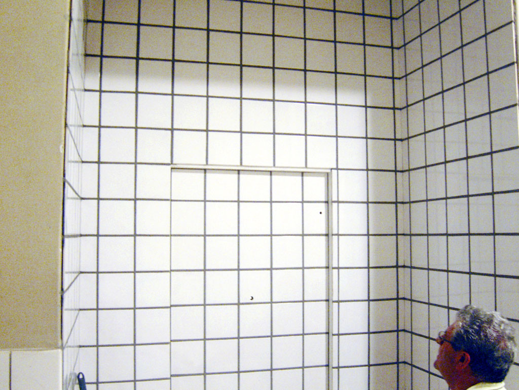
Tiled entrance door closed and under construction by artisan Francisco Javier Ramo Soriano
Tile
DD: Tell us about your favourite project that you used tile in – interior, facade, etc.
BU: One of my favourite projects in which we used tiles is our design for an “Office and Hotel Room” that was recently completed in the centre of Rotterdam. There, since the entrance of the project was already slightly set apart from the main staircase towards a little niche, we saw an opportunity to create a “secret” and hidden door to the office and hotel room, which would disconnect the space magically and as a hideaway from the business of the city and ‘real life’ in general. To emphasize the hiddenness of the place, we continued the existing white ceramic tiles from the corridor into the niche of the entrance and covered the entire door with the same tiles too, which camouflages the entrance to such an extent that until today the postman is having trouble finding it.
DD: What are the strengths and weaknesses of tile?
BU: Apart from being a hard-wearing material with an ability to cover surfaces in a simple, solid, and affordable way, we consider the ability of tiles to create complex mosaics – and with it narratives and multifaceted meanings – as one of its greatest strengths. This quality we wanted to use when we designed one of the lavatories for the “Office and Hotel Room” project. Because, while the main space of the project is white, open, neutral, and flexible, this lavatory contains an impressive hand-made piece of art depicting a palm tree, a 1:8 reproduction of a design originally made by STAR strategies + architecture and intended for a public square in the city of Elche, Spain. Thus, the clients, admirers of Adolf Loos, preferred to keep the most excessive ornamental space for private use. In order to realize the time-consuming mosaic, which, in our particular case, could be viewed as a weakness of the use of tiles for this project, we flew in an expert and artisan from Spain.
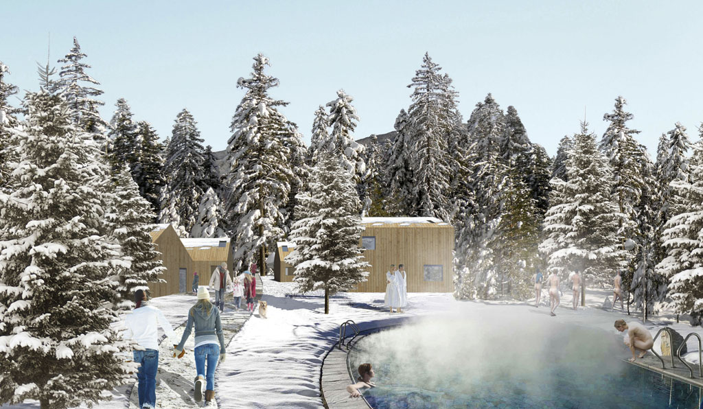
The trees that need to be cut to create the ski slopes will be used to build the new tourist centre
Wood
DD:Tell us about your favourite project that you used wood in or another architect’s work – interior, facade, etc.
BU: Not so long ago we worked on a design for a tourist centre – a recreational ski complex with 27 ski slopes in the area of Klekovaca Mountain in Bosnia and Herzegovina. When we realized during the design process that for the creation of the ski slopes a large number of trees had to be removed, we decided to re-use them. Thus, we proposed to use the wood from the trees to build the new tourist centre. In that way the wood could be used not only for the structures, but also for the facades of most of the buildings. Accordingly, we called the project “Out of the Woods”. With the help of the trees and by using the different geographical features of the site, we suggested to organize the tourist centre in 3 different areas with 3 different layouts and atmospheres embracing the natural beauty of each location: a compact Main Resort Centre next to the skiing plateau and the ski slopes; a Hotel and Sports Complex on the nearly flat area of the site with individual buildings standing free as the trees in the context; and a Climatic Health Resort Zone in the pine woods.
DD: What are the strengths and weaknesses of wood?
BU: There are a large number of advantages that made wood one of the most favourite construction materials of humans for thousands of years. Some of its strengths are without doubt related to its abundant availability, the ability to renew the supply, but also – and in particular – to its longitudinal shape, its toughness but at the same time lightness, and its easy formability and the ease of making joints due to the softness of most of the trees, which makes it a great material to build all kinds of things, such as houses, boats, furniture, to name just a few. However, one of the weaknesses of wood that I would like to point out is that it can not be produced at a particular location in the way bricks, tiles, or glass can be fabricated – trees need to grow for a long time before the wood can be used – and harvest and transport come with a lot of challenges. In the “Out of the Woods” project we wanted to avoid the difficulties related to the transport of wood by using it right at the spot for the construction of the new tourist centre.
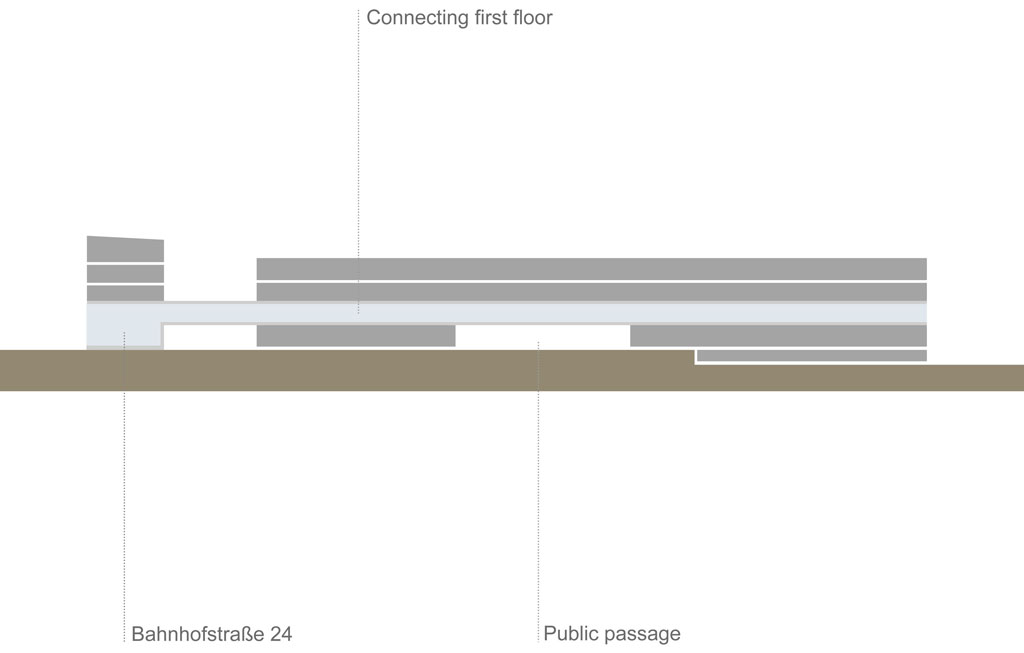
Easy orientation within the entire building complex is ensured by a connecting transparent first floor
Glass
DD: Tell us about your favourite project that you used glass in – interior, facade, etc.
BU: We recently reached the final phase in an architecture competition for the extension of the District Office in Görlitz, Germany with a project that we called “High and Dry” and in which the use of glass was crucial for its success. Because in order to ensure easy orientation for guests and employees within the entire building complex we created a glazed connecting first floor, providing access to all other buildings of the administrative campus barrier-free, using one of the greatest qualities and strengths of glass: being optically transparent, yet supplying a sufficient division of the inside from the outside of a building. Through this transparent connecting first floor that we created in an elongated administration building inside the block with three wings and three bridges, all the future departments of the enlarged district office will be accessible from the entrance “high and dry”.
DD: What are the strengths and weaknesses of glass?
BU: When it comes to architecture, one of the considerable weaknesses of glass – next to its porousness that exposes it to the constant risk of cracking – is its ability to transmit light and heat, if too thin and unprotected, that can easily overheat interior spaces during sunny days. To avoid that from happening we proposed to install aluminium profiles as Brise Soleil with a shading effect all over the glass facade of the “High and Dry” project. The use of triple glazing helped keeping the interior spaces in moderate temperatures during the summer months. The proposed highly effective sunscreen made of stainless steel limb-weave also ensured agreeable interior temperatures during hot days. All these measures led to a highly energy efficient administrative building.
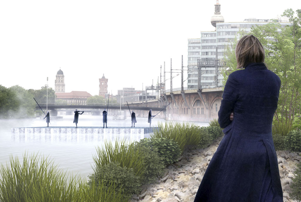
We proposed to use the existing machines of the ice-making factory on the opposite bank of the Spree River in Berlin to produce the floating stage out of block ice pieces
Concluding questions
DD: What are some architectural projects that inspired you regarding brick, tile, and/or glass? And why?
BU: To a certain extend the tiles that we used to clad and camouflage the entrance door to the “Office and Hotel Room” were inspired by the famous tiles and grids of Superstudio. When we entered the building of the project the first time, we were intrigued by the existing tiles of the staircase – which many people of the building considered ugly and thus wanted to get rid of, but which we liked particularly because of their reminiscence to projects of Superstudio. Therefore, we wanted to do something with them right from the start. The negative attitude of the neighbours towards the tiles also triggered our interest in them. What we always liked about Superstudio is how they used the tools of art and literature, but also the rhetorical devices of metaphor and allegory, and the tools of irony and imagination in their projects, “manoeuvring through the no-man’s-land between art and architecture so as to attempt forays into politics, sociology and philosophy”, as Adolfo Natalini, one of the original founders of Superstudio” once described it in an interview called “Deadly Serious” that was published in issue #14 of our publication “MONU – Magazine on Urbanism”.
DD: Tell us about the materials you are interested in or want to use in your projects right now.
BU: Lately, we have become fascinated by ice as a building material. What we like about it is on the one hand its semi-transparent character that, if used as a wall, allows you to look through it, but not entirely, which adds a kind of mysteriousness to the spaces behind, an effect that is similar to translucent glass. But what we like most about it, is its instability when comes to its form when exposed to temperatures above zero degrees Celsius. This appealing ephemeral character and aspect of ice we used when we recently designed a floating theatre on the river Spree in Berlin that was created out of blocks of ice. And since this stage only melts after a couple of days in the water, every performance becomes an ephemeral event unfolding into a unique moment in time that you don’t want to miss. Accordingly, we called the project “A Unique Moment”.
Title: Architectural Material
Author: Bernd Upmeyer
Date: June 2018
Type: Commissioned interview
Publications: Architectural Material 1: Brick & Tile, Architectural Element 2: Wood, Architectural Element 3: Glass
Publisher: DAMDI
Location: Seoul, South Korea
Interviewer: Jinyoun Na
Pages: Brick & Tile: 10, 15, 24, 27, 31, 34, 38, 72-75, 420; Wood: 10, 18, 26; Glass: 10, 18, 26, 322-325