01-09-14 // SHADES OF GREY
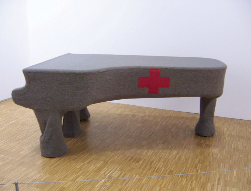
Homogeneous Infiltration for Piano, Joseph Beuys, 1966
Bernd Upmeyer contributed a piece entitled “Shades of Grey” to the Saturated Space Research Cluster at London’s Architectural Association. The article celebrates the colour of grey as one of the most relevant colours of today because of its symbolic power to represent diversity. The text reveals how the colour grey is never simply grey, but can be read as hiding colours beneath layers and veils. It furthermore shows how grey can be, despite its bad reputation, sparkly, distinct, eye-catching, exceptional, and a symbol of life, evoking the idea of the entire chromatic spectrum in the viewer’s imagination. To illustrate where and how these neglected qualities of grey occur the text provides examples from the field of graphic design with a focus on grey layouts; from architecture by pointing out the contemporary blurry greyness of the internet as a medium of display; and from urbanism where extreme-commuters live increasingly transnational and grey urban lifestyles.

Student, Gerhard Richter, Oil on canvas, 1967
Shades of Grey
One of the most fascinating aspects about colours, whether in graphic design, architecture, or urbanism, may be found in their symbolic power and in what they are able to represent. In terms of symbolism, in my opinion, the most relevant colour of today, as well as in the future, can only be one hue: GREY. Why? Because despite being one of the least popular colours and despite its bad reputation as the colour of conformity, a colour without any personality of its own, associated with boredom, solitude, emptiness, pain, guilt, misery, and death, it represents most of all: DIVERSITY. When mixing different colours and especially complementary colours such as orange and blue, or when mixing black and white in various proportions, you find that you end up with different shades of grey. In that way grey is never merely simply grey, but can be read as hiding colours beneath layers and veils. The safest way to receive a rather neutral grey, for example, is by combining equal amounts of cyan, magenta, and yellow. Yellow, orange, and red create, a “warm grey”, while green, blue, and violet create a “cool grey”. Artists such as Joseph Beuys or Gerhard Richter have used grey tones in their art to provoke the creation of colourful complementary images in the viewer’s imagination that imply the idea of the entire chromatic spectrum. The ability to interact in such a way with the viewer’s response adds an openness and accessibility to the colour grey…
…continue reading the entire article in Publications or here.