01-09-14 // SHADES OF GREY
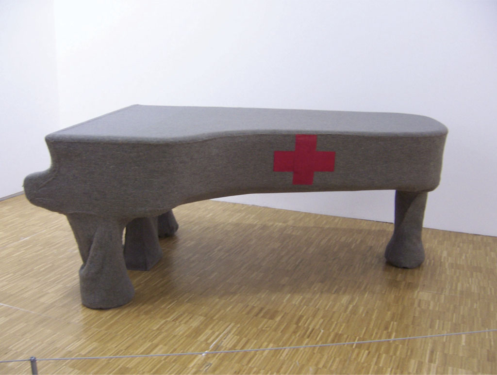
Homogeneous Infiltration for Piano, Joseph Beuys, 1966
Shades of Grey
By Bernd Upmeyer
One of the most fascinating aspects about colours, whether in graphic design, architecture, or urbanism, may be found in their symbolic power and in what they are able to represent. In terms of symbolism, in my opinion, the most relevant colour of today, as well as in the future, can only be one hue: GREY. Why? Because despite being one of the least popular colours and despite its bad reputation as the colour of conformity, a colour without any personality of its own, associated with boredom, solitude, emptiness, pain, guilt, misery, and death, it represents most of all: DIVERSITY. When mixing different colours and especially complementary colours such as orange and blue, or when mixing black and white in various proportions, you find that you end up with different shades of grey. In that way grey is never merely simply grey, but can be read as hiding colours beneath layers and veils. The safest way to receive a rather neutral grey, for example, is by combining equal amounts of cyan, magenta, and yellow. Yellow, orange, and red create, a “warm grey”, while green, blue, and violet create a “cool grey”. Artists such as Joseph Beuys or Gerhard Richter have used grey tones in their art to provoke the creation of colourful complementary images in the viewer’s imagination that imply the idea of the entire chromatic spectrum. The ability to interact in such a way with the viewer’s response adds an openness and accessibility to the colour grey.
Grey Graphic Design
Such an openness and accessibility with a focus on diversity was what we wanted to create with MONU, a magazine on urban topics that I founded around ten years ago and have run ever since. By using no other colours but black and white and only different shades of grey in MONU’s layout, especially in the first eleven issues, we tried to emphasize diversity as the core value of the magazine. However, the choice for black and white was initially also a way of preventing the high costs of publishing. That kind of “Grey Graphic Design” represented, in my view, the diversity of contributions that we aimed to feature in MONU. In order to reach a high level of diversity, we introduced, among other things, the device of “call for submissions”, which was inspired by the realization that the view of one person is limited. We wanted to open up the magazine to different and changing perspectives, as we deeply believe in the quality of diversity that lead eventually to a better understanding of how cities work, to fuel the debates surrounding them, and ultimately to improve our living conditions within them. When we started using colours for the first time in 2010, after the magazine was already six years old, we tried to reveal some of these hidden colours beneath the previously prevailing greyness and experimented with signal colours such as red and orange. But neither the use of black and white, nor the selective introduction of certain colours into the magazine was ever a fashion statement, as we never wanted the magazine to be dependent on trends or fashions. MONU magazine was created to last, and with a long-term perspective in mind, and was never supposed to be dependent on certain colour trends, because just as the meaning of art has changed over time, the meaning of most of the colours has changed as well and will change again in the future. Just look at the colour purple, since prehistoric times and the ancient world the colour of kings, nobles, priests, and magistrates, but during the 1960s and early 1970s suddenly associated with counterculture and psychedelics, used by many musicians of that time to express their viewpoints and way of life. But “grey”, understood as a representation of diversity, will never go out of fashion.
Grey Architecture
When I think about colours in architecture, I consider it at the moment most relevant and interesting to talk about the way in which architecture is currently presented on the internet. Because when I look at the internet as a medium to present architecture, I see such a gigantic number of projects on an ever-increasing number of sites that it is exceeding my capacity to consume it all. The colours of all these projects start to appear to me more and more as one enormous grey blur. Sometimes, one longs back to the old days when only a relatively small number of printed magazines and books were publishing architectural projects with a seemingly clear set of criteria and categories in relation to what was published.
However, recently I started to see the entire phenomenon of abundance that dominates contemporary architectural online publications in a more positive light and even this “grey blur” as a representation of diversity. I perceive it as something that is in the process of becoming something more meaningful very soon, but is currently in a kind of premature state and a kind of situation, in which everything can still either turn into something good or bad. Everything probably just needs to be better organized and edited in a stronger way to turn it into something more appealing. This would stop the current phenomenon that the most active and loudest architects are the most visible, rather than the most relevant and interesting ones. Obviously, the potential of the internet in relation to the presentation of architectural projects has not been exhausted entirely yet and its future success remains unclear. But what I see as the most positive part in this whole process is its democratic aspect that clearly supports diversity in architectural production. This aspect could be embraced more by including, for example, more relevant but unknown and unseen projects from whatever remote location in the world. The democratic aspect of the internet supporting diversity when it comes to architecture is also the reason why I like it when I hear people today complain about the rise of an all-consuming greyness in online published architectural work and that the current designs of spaces are blending into a uniform gradient of smooth greys, because it reveals and symbolizes for me a high level of diversity, as I interpret such a “Grey Architecture” as an architecture that includes everybody and all possible colours, forms and spaces, and as something ultimately rich and diverse that can therefore only be beautiful.
Grey Urbanism
On the scale of cities I find another type of “greyness” increasingly interesting and probably dominating the future: the urban way of life of people that start living in a second, third or fourth, etc., city in a second, third or fourth, etc., nation-state, without saying goodbye entirely to any of the cities at any moment. I would describe this way of life as “Grey Urbanism” as in different cities is lived in at the same time and the different cities are mixed as different colours. Grey Urbanism is therefore a special form of transnationalism, a phenomenon of sociology that results from social interactions across the boundaries of nation-states. Ideally, a “grey urbanist” continuously moves back and forth between several cities as an extreme commuter, and lives in constant transit between several homes. Grey urbanism appears as a global phenomenon that is based on the increasing mobility of people between cities of different countries and different continents, which makes grey urbanism probably one of the most interesting urban forms of life of the twenty-first century. Because of the repeated change of location, grey urbanists exist, to a certain extent, in a certain utopian state, which is characterized by a constant longing, or a constant homesickness, for the other city. A particular form of that way of life could be, for example, “Binational Urbanism”, a term that I coined in one of my recent research studies. A binational urbanist commutes constantly between two cities that can be very different from each other, like black differs from white, such as the relatively small German city of Siegen differing from the much bigger Turkish city of Ankara. But as none of the two cities will ever cease to be home, binational urbanists never have to decide between black and white, but live with both colours in a kind of “grey” urban life. This life is characterized by the different but complementary qualities of both cities that are used by the binational urbanist in a positive and productive way. A person that constantly commutes, for example, between Siegen and Ankara, can use and enjoy the cultural richness of Ankara with its museums and theatres on the one hand, but also the remoteness and quietness of the city of Siegen on the other. The fact that people often are not only commuting between cities, but also between particular neighbourhoods of cities, makes binational urbanism – but grey urbanism in general as well – a way of life that occurs not only on the abstract level of cities, but precisely also on the level of city districts and quarters, in which individuals find their urban communities on a personal level.
A World of Light
In relation to the abovementioned contemporary phenomena in graphic design, architecture, and urbanism I would like to pay tribute to grey as a colour that appears only at first sight and on the surface as dull, unclear, inconspicuous, ordinary, vague, distanced from life, as an indication of decay, or even of death. Once you dig deeper it reveals its richness and colourfulness as a symbol of diversity, whether in graphic design, architecture, or urbanism. Because under the surface grey can be sparkly, distinct, eye-catching, exceptional, clear, close to life, an indication of improvement, and a symbol of life, embracing diversity. When Beuys was asked once, for example, why he works chiefly with alien, grey materials, he answered that, yes, he works with grey felt and that people might wonder why he does not work with colours. But according to him people never continue the train of thought far enough to think: yes, if he works with felt, might he not be producing a coloured world within us? Take the well-known phenomenon of complementary colours: if you watch a red light and close your eyes, you see a green after-image. Beuys furthermore stated that people are very short-sighted in their logic when they say that he makes everything out of grey felt and that no one asks him whether he might not be aiming to evoke the entire world of colour in people as a counter-image. In other words, to provoke in them a world of light.*
* Beuys, Joseph (Author); Harlan, Volker (Editor). (2004). What is Art?: Conversation with Joseph Beuys. Clairview Books. Page 98
Title: Shades of Grey
Author: Bernd Upmeyer
Date: September 2014
Type: Commissioned article
Publications: Saturated Space
Publisher: Saturated Space Research Cluster at
London’s Architectural Association
Location: London, UK
Pages: 8