10-03-18 // ARCHITECTURAL ELEMENTS – INTERVIEW WITH BERND UPMEYER
View of the new Estonian Academy of Arts at night with the “public section” cutting from right to left through the building
Architectural Elements
Interview with Bernd Upmeyer
Stairs
DAMDI: What is the favourite stair you have designed and why?
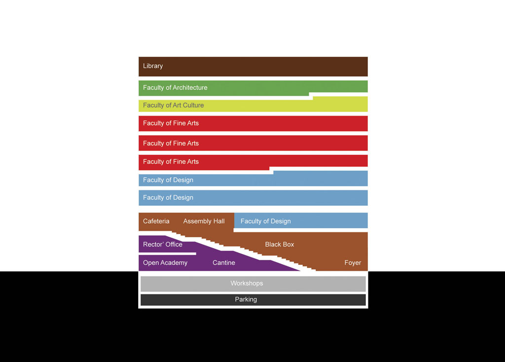
Bernd Upmeyer: One of my favourite stairs we designed was for the New Building for the Estonian Academy of Arts in the city of Tallinn. There, we clustered the entire public programme of the building that contained all the auditoriums and galleries of the academy and created a huge stair out of it, which we called the “public section”. It cuts through the entire building but, thanks to acoustic curtains that separate the different units, remains functional even during lectures, performances, or events. Without any event going on, the stair functions as an extension of the foyer of the academy located on the ground floor.
DD: What is the least favourite stair you have designed and why?
BU: When recently we worked on a design for a new office and administration building for the Rosa Luxemburg Foundation in Berlin, we proposed six large escalators that bring the visitors from the foyer to the top floor and a roof terrace that allows a view of the city and the TV tower on the Alexanderplatz. It is not that I disliked these escalators, I like them a lot. However, after our project was not selected during the competition in which we took part, I was wondering whether the use of escalators, to a certain extent the symbols of commercialization and capitalism, for the stairs in the building might have appeared a bit too provocative and controversial for a foundation with strong ties to Marxist philosophy and Marxist theory.
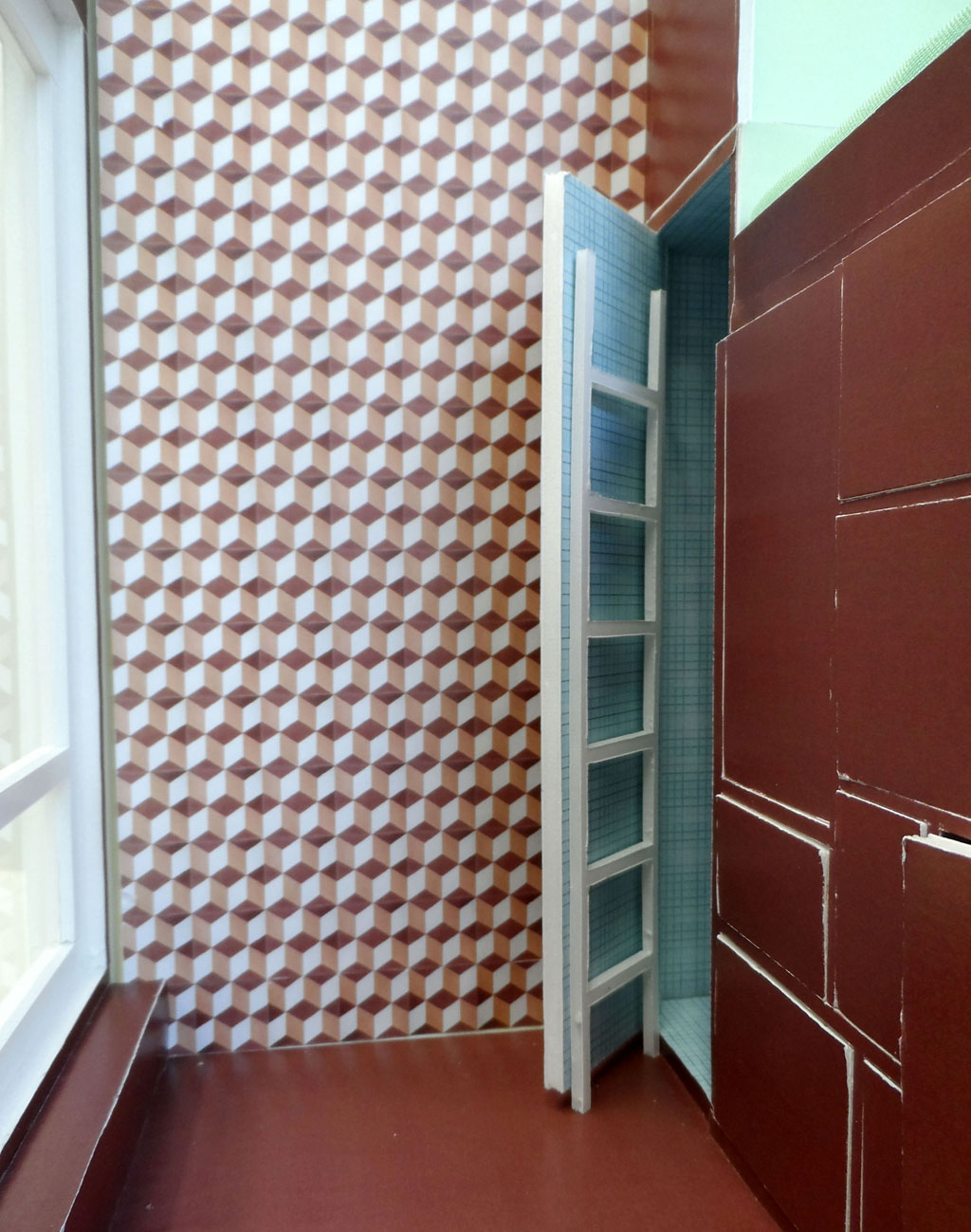
The metal ladder-like stair hanging at the inside of the toilet with the rain-shower, ©BOARD and STAR – strategies and architecture
DD: Are there any memorable moments about designing stairs?
BU: Together with the office STAR – strategies and architecture – we designed a very small living space in Rotterdam that is 3m high, 1,97m wide, and 3,6m long. We called it “The Cabanon” and believe that – with a size of 6,89m2 – it is most likely the smallest apartment in the world. It has four rooms: a living room with kitchen, a toilet with rain-shower, a bedroom with plenty of storage, and a spa. Once we finished the design, we realized that the apartment was so small that there was not sufficient space for a proper stair that would bring you up to the elevated bedroom. So, we had to improvise and designed a metal ladder-like stair that was heavy enough to bring you up safely but light enough to transport and hang inside of the toilet with the rain-shower.
DD: Are there any stairs you are inspired by? What was inspirational about it?
BU: During a school trip with my Latin class at the beginning of the 1990s, I traveled to Rome for the first time. Our accommodation was located very close to the Spanish Steps, a monumental stairway of 135 steps, which deeply impacted the way I perceive public spaces. As our budget did not allow us to go out during that trip, we spent almost every evening sitting on the steps of this gigantic stair that functioned like an outdoor theatre, watching the people pass by and enjoying the lively atmosphere that attracted hundreds of people every night. There I realized what steps and stairs can do to a public space, which inspires me until today. The abovementioned stair of the Estonian Academy of Arts in Tallinn is clearly inspired by the Spanish Steps.
DD: What was the most memorable stair design you have seen and why?
BU: When I visited the Venice Art Biennale 2017 I was quite impressed by the work of Giorgio Andreotta Calò that was exhibited in the Italian Pavilion. There, a stair played a crucial role in the success of this installation, as it provided access for the audience, functioning as a kind of hinge and switch between two worlds, to an upper part of the piece. This dividing aspect and power of the stair I perceived as most appealing. Because the work was composed of two parts: in the lower part the visitor had to walk through a sequence of scaffolding in order to reach the stair leading to the upper part of the installation. Once upstairs, a view on a large surface, which turned out to be made of water, opened up, revealing a spectacular image that was composed by the old timber truss ceiling of the space above and its mirrored version below.
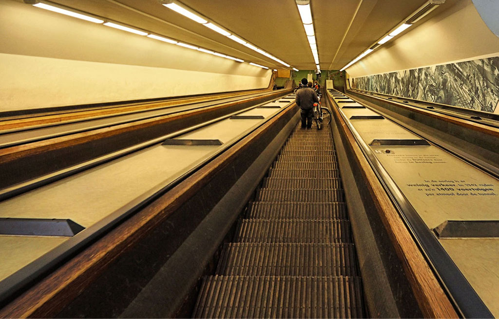
Maastunnel with wooden escalators, photo by Stichting Microtoerisme
DD: Are there any myths, stories or superstitions about stairs in your country?
BU: There are some interesting stairs, which are in fact escalators made of wood that can be found in Rotterdam in the so-called “Maastunnel”. The tunnel connects the northern with the southern part of Rotterdam under the river “Maas”. About 75,000 motor vehicles and especially a large number of cyclists and pedestrians use the tunnel daily, making the Maastunnel an important part of Rotterdam’s road network. The tunnel was opened to the public on 14 February 1942 and was the first car tunnel in the Netherlands. The fact that the escalators are made of wood is most intriguing, because that material creates a very domestic and homey atmosphere in this public space that is usually dominated by traffic and is thus everything but inviting.
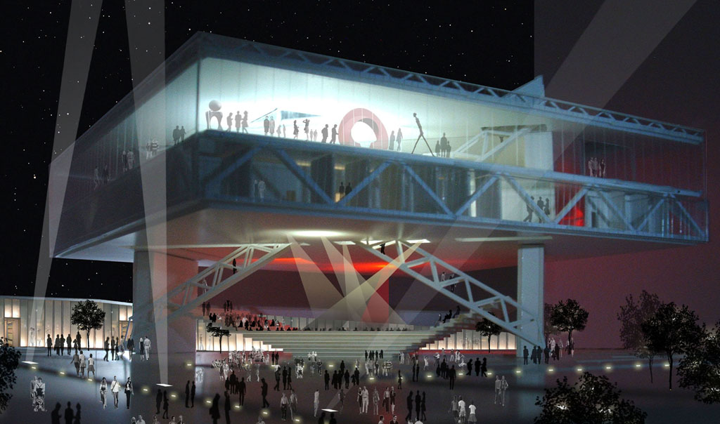
The completely opened facade of the House of Arts and Culture in Beirut
Entrance
DD: What is the favourite entrance you have designed and why?
BU: In 2009 we made a design for the House of Arts and Culture in Beirut in Lebanon that we entitled “Free Space”. The entrance to this building is one of the favourite entrances I ever worked on, because it does not really exist, or exists only occasionally and when the façade, which can be moved up, is moved down and closed – only then doors become necessary. However, when the façade is moved up, the ground floor is basically an extension of the public space that surrounds the building. This establishes a great freedom to cross the site and the building in all different directions and to integrate the building in the urban context, but also to use the performance and exhibition areas on the ground floor flexibly with adaptable spaces.
DD: What is the least favourite entrance you have designed and why?
BU: The freedom of being able to cross the building from all different sides and directions, similar to the one we created for the House of Arts and Culture in Beirut, we tried to achieve recently for the design of a youth center in the city of Heidelberg in Germany, too. Nevertheless, since the client urged us to define one clear main entrance, we had to create a recognizable hierarchy among all the entrance doors. Due to this fact the entrances of this project became less exciting for me, making the main entrance my least favourite one of this project. Because with the equal status of all the doors and the possibility of free crossing we wanted to connect the surrounding neighbourhoods, but also the open spaces with each other through the building.
DD: Is there any special meaning to entrances in your country? Or does the entrance have any special meaning for you? How is that reflected in your design?
BU: In the Netherlands, and especially in cities such as Amsterdam, but in Rotterdam too, many apartments have large windows that bring a lot of light into the house and offer great views to the outside. A consequence of this is that there are as many views possible from the outside, especially from the street-level into the apartments on the lower floors of buildings, as from the inside. However, the doors of the entrances of these very transparent buildings are usually made out of wood and thus often rather opaque. I consider that to be a remarkable aspect, as you would normally expect people to like to have less of a view into their apartments, but more visibility at the doors, particularly for the moment when strangers might ring your doorbell, who you might want to see before opening. Paradoxes like this have inspired many of our designs.
DD: What was the most memorable entrance (door) design you have seen and why?
BU: Related to the abovementioned non-hierarchical entrances we designed for the House of Arts and Culture in Beirut and tried to achieve for the youth centre in Nuremberg, I was pretty amazed by Peter Zumthor’s design of the Swiss Pavilion at the World’s fair EXPO 2000 in Hannover, Germany. What struck me most was the fact that the pavilion – a wooden pile constructed out of 144 km of lumber of larch and Douglas pine from Swiss forests assembled without glue, bolts, or nails – did not have a particular entrance, but could be entered equally from all sides. Thus, what I found most memorable about the entrances of this structure was the absence of any door, which created a non-directed and democratic building.
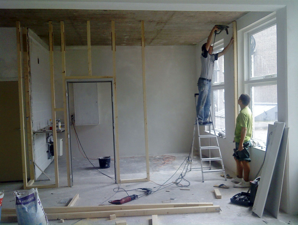
The construction of the new wall for the meeting room integrating the bulletproof door and window, photo by Beatriz Ramo
DD: Have you ever done a renovation yourself? How did you change/treat the door?
BU: When we moved a couple of years ago into our new office space in the eastern part of Rotterdam’s city centre, we renovated the place nearly entirely by ourselves. We only needed the professional help of a builder to remove and build some walls. The rest we could manage. As the space was formally used by a shop selling and buying diamonds, it had a security door and a large window with bulletproof glass at the entrance, including security cameras. As we did not need such a high-security entrance, but wanted to build a meeting room that could function as a kitchen and lunch place as well, we removed one of the doors, including the window, and used these for the meeting room. Ever since we hold our meetings in a bulletproof room.
DD: Any tips on doors when doing a renovation without professional help?
BU: What we realized while renovating our own office is that you should plan much more time for everything than you would usually do with professional help. That is because usually most of the things never work out as you imagined and there are always a lot of unexpected technical problems occurring. Additionally, as a non-professional builder, you normally lack a lot of specific tools to solve these problems. You also do not always know which materials, connections or technical equipment you need, which makes you run to the hardware store a lot of times. When we fixed, for example, the bulletproof door in the meeting room, it all of sudden did not fit into its metal frame any longer and specific tools were necessary to remove parts of it, which we did not have ourselves.
DD: Are there any myths, stories or superstitions about entrance (doors) in your country?
BU: Some years ago, when I was invited to take part in a debate about the quality of Rotterdam’s architecture and urban spaces at the Netherlands Architecture Institute in Rotterdam, a movie was shown that was, to my surprise, ridiculing the entrance of Rotterdam’s “Kunsthal”, designed by Rem Koolhaas. I learned that there exists a polemic in the Netherlands about this entrance situation that I always considered to be very remarkable as you reach it by crossing the building in its centre through a public path. Apparently, there are certain people in the country who deem this entrance at this position impossible to find and consequently, in the movie, people were shown walking around the Kunsthal several times without finding its entrance.
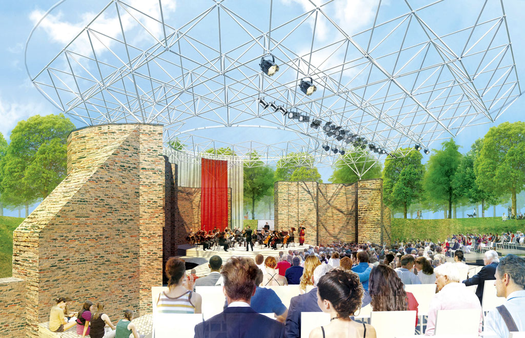
View of the roof of the open-air theatre in Hulst from the stand
Roof
DD: What is the favourite roof you have designed and why?
BU: For the Dutch city of Hulst we once designed a temporary roof for an open-air theatre that could be easily assembled, disassembled, and stored, together with a temporary stage, temporary tribunes, and 500 chairs in a 3 metre high space of about 40m2 surface area. This made the storage of the roof and the other temporary elements very easy during the winter months when the theatre was closed, and eliminated the need to build an entirely new warehouse. I was pleased that we achieved that by creating a simple steel structure made of thin steel struts. Moreover, the roof can easily be closed in case of rain, with its system of waterproof fabric, and a curtain that surrounds the roof can create a closed interior space around the stage and a small temporary stand for 100 seats.
DD: What is the least favourite roof you have designed and why?
BU: Last year we worked on the design for an extension of the town hall in a small town in Germany called Korbach, where we proposed a one floor high building that connects to all the other new extensions. We placed this connecting building on the first floor to provide occasional access for the public to the centre of the site on the ground floor, where we created a public square with an open-air theatre. We were quite convinced of the success of this elevated building that worked as a roof for the public space underneath. But we got the impression that the prevailing and continuing negative reputation of spaces under elevated buildings for which modernism can be blamed – which we believe needs to be overcome – eventually led to the fact that the design was not chosen.
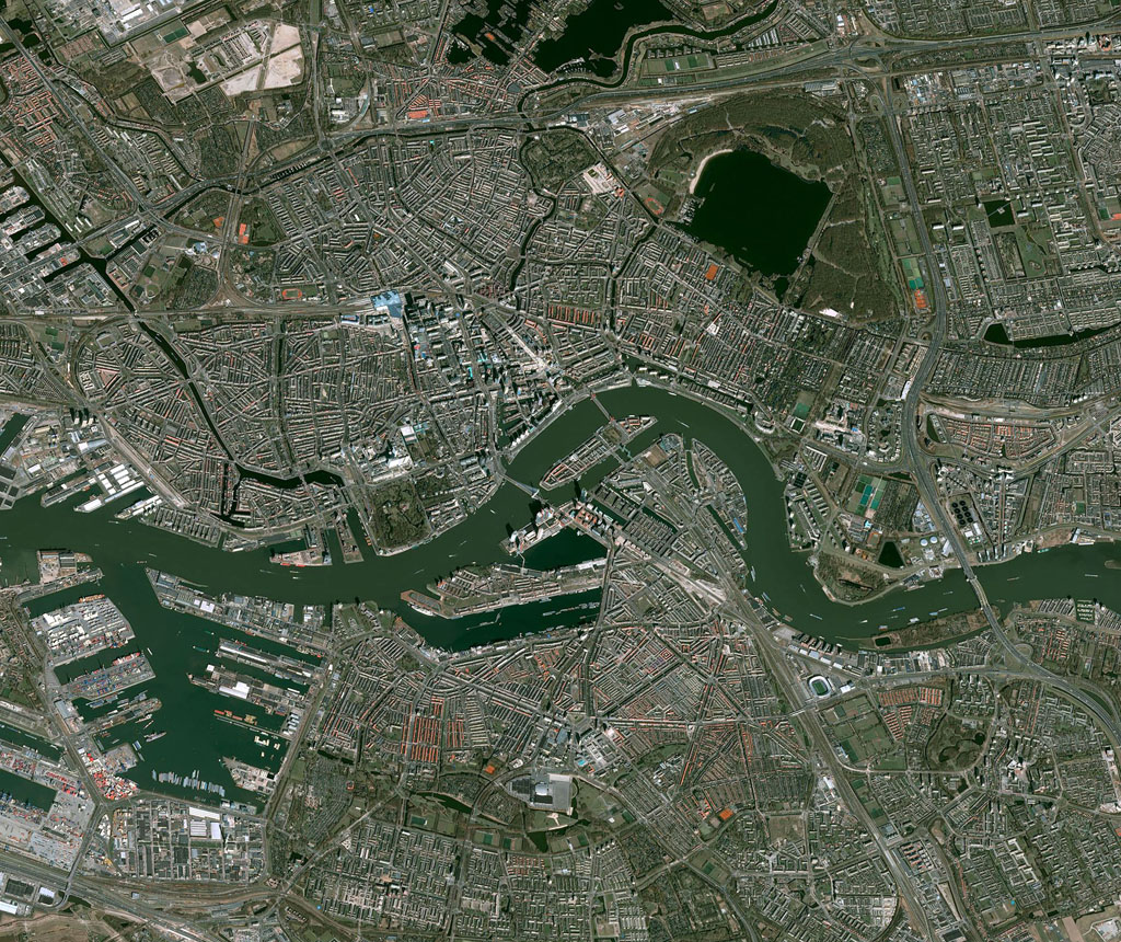
Satellite view of Rotterdam
DD: What is the most typical colour of roofs in your country? Is there a reason for that?
BU: When you look at Rotterdam from above and with the help of Google Maps, you will see a lot of grey roofs, which has to do with the large number of modern buildings with flat roofs in the city. Most of these buildings were built after WWII when the centre of Rotterdam was almost entirely destroyed. The grey colour comes typically from the bitumen layer or stone chippings on the flat roofs. Nevertheless, you will find a certain number of pitched roofs from the prewar era too, which normally are cladded with roof tiles that come in different colours such as red, brown, but also grey. Since cities such as Amsterdam were less affected during WWII, the number of pitched roofs there is higher which makes these cities appear more reddish when viewed from above. However, the prevailing colour there is rather grey too.
DD: What was the most memorable roof design you have seen and why?
BU: One of the roof structures that I consider as outstanding is the São Paulo Museum of Art in Brazil designed by Lina Bo Bardi. What I am referring to in particular is the space under the building, where the elevated museum in its entirety becomes the roof of that space. To elevate a public building, which is usually supposed to have a strong presence on the ground, in such a way I consider as very brave and fascinating, especially as this open space becomes a place for the people that can be accessed free of charge and used flexibly for many things such as markets, performances, or other events.
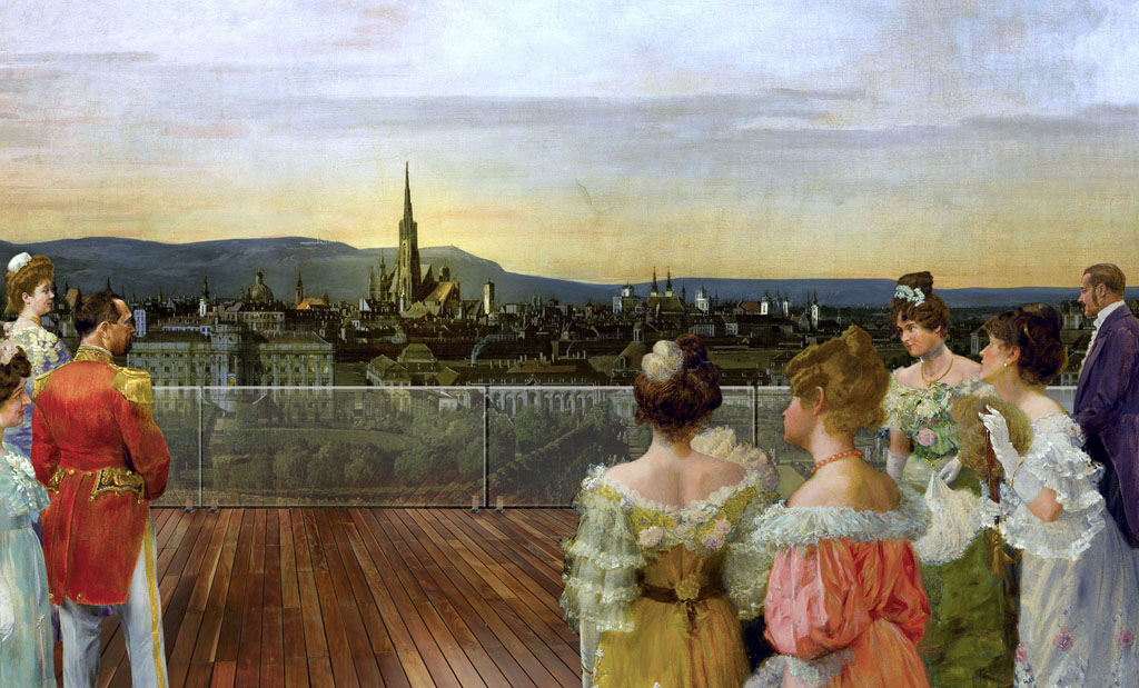
View from the roof terrace of the “Vienna-room” to the centre of Vienna
DD: Do you have a certain approach or your own unique touch when designing a roof? If so, what is the reason? If not, what kind of signature design would you make?
BU: What I find interesting is when a roof is not merely perceived and used as a structural element and as a part of a building envelope that is covering the uppermost part of a building, but for other purposes that can be, for example, social or cultural. When we worked on the design for the extension of the “Vienna Museum” in Austria, we added several pavilions to the already existing ones in front of the museum as part of the extension. On the upper floor of one of these pavilions we located the so-called “Vienna-room”, which is a flexible space that is publicly accessible and has a coffee bar on the upper floor and a roof terrace that is located above the surrounding trees and overlooks the square and the city.
DD: Are there any myths, stories or superstitions about roofs in your country?
BU: Since 2015 Rotterdam every year organises the so-called “Rotterdamse Dakendagen”, which can be translated as “Rotterdam Rooftop Days”. It is a three-day festival that celebrates the roofs of Rotterdam’s buildings by making many of them publicly accessible to stimulate their use and development. The idea to create an annual event on the roofs of Rotterdam developed out of a mini-roof festival called “Poems from a Rooftop” that took place in 2013 as part of a music festival, which included the use of rooftops for bars and organized excursions to roofs. Today it is a festival that provides public access to more than forty roofs for exciting discoveries, informal drinks, intimate concerts, silent discos, film nights, sports activities, and children’s programmes.
Title: Architectural Elements
Author: Bernd Upmeyer
Date: March 2018
Type: Commissioned interview
Publications: Architectural Element 1 – Entrance, Architectural Element 2 – Stairs, Architectural Element 3 – Roof
Publisher: DAMDI
Location: Seoul, South Korea
Interviewer: Jinyoun Na
Pages: Entrance: 11, 44, 48, 52, 58-59, 65, 71, 92, 96, 104, 106-107, 109, 116-117, 119;
Stairs: 10-11, 42, 48-49, 57, 64-65, 80, 89, 104, 112, 126, 133, 135;
Roof: 11, 56, 60, 70, 87, 96, 104-105, 122, 124, 134, 140-141, 143